
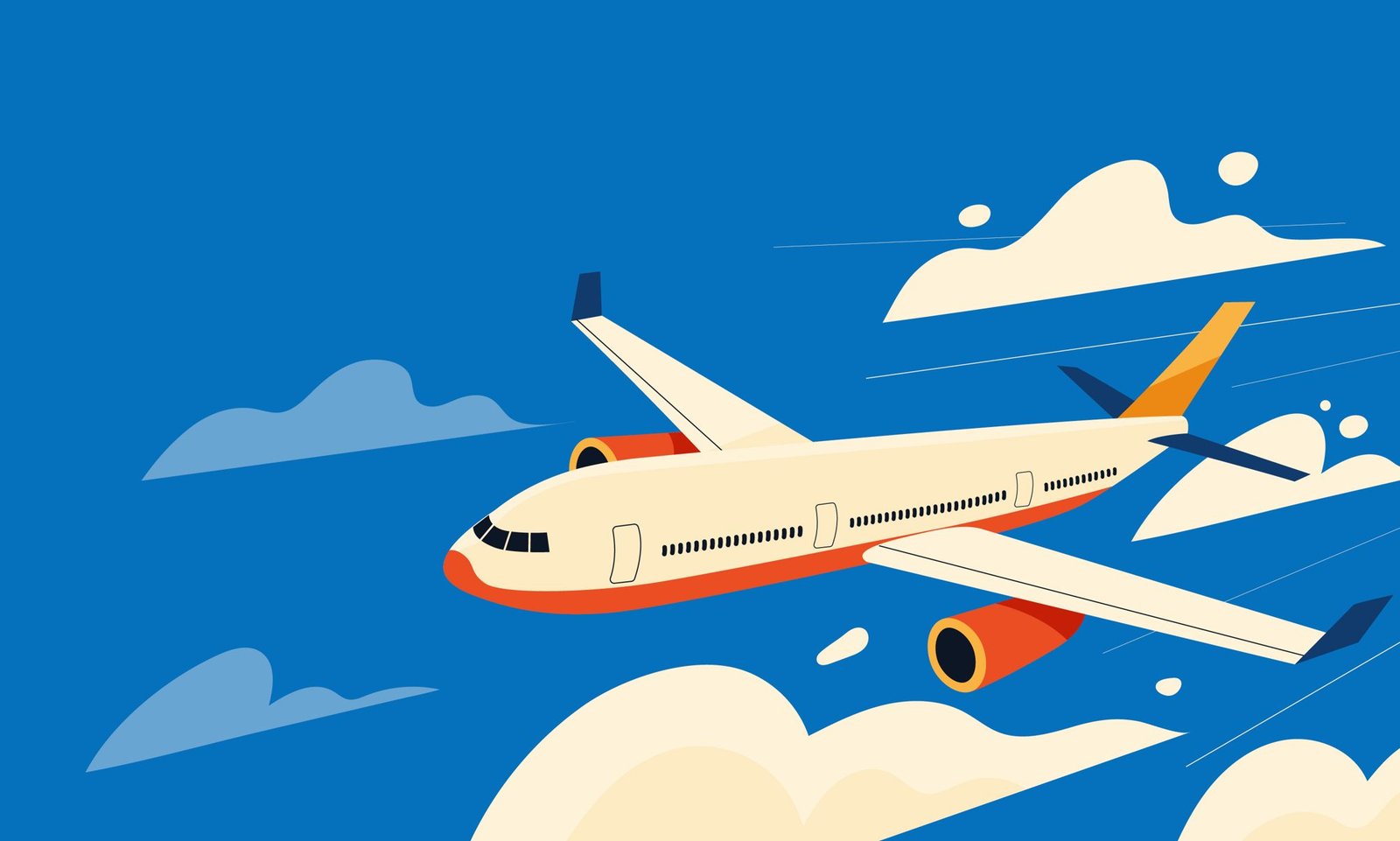

There’s a famous saying that "Simplicity is the ultimate sophistication." Yet, in the modern world, we often hear complaints that branding has become "soulless" or "too corporate." This is also rather true in the aviation industry. While other industries play with vibrant palettes and experimental elements, aeronautics tend to live in a limited world of navy blue or gold, with either corporate standard or luxurious aesthetics, there’s no in-between.This puts aviation brands in 2026 in a tough spot. They’re essentially talking to two completely different crowds: high-end flyers looking for luxury and prestige, and regular travelers who just want clear information and a brand they can trust.

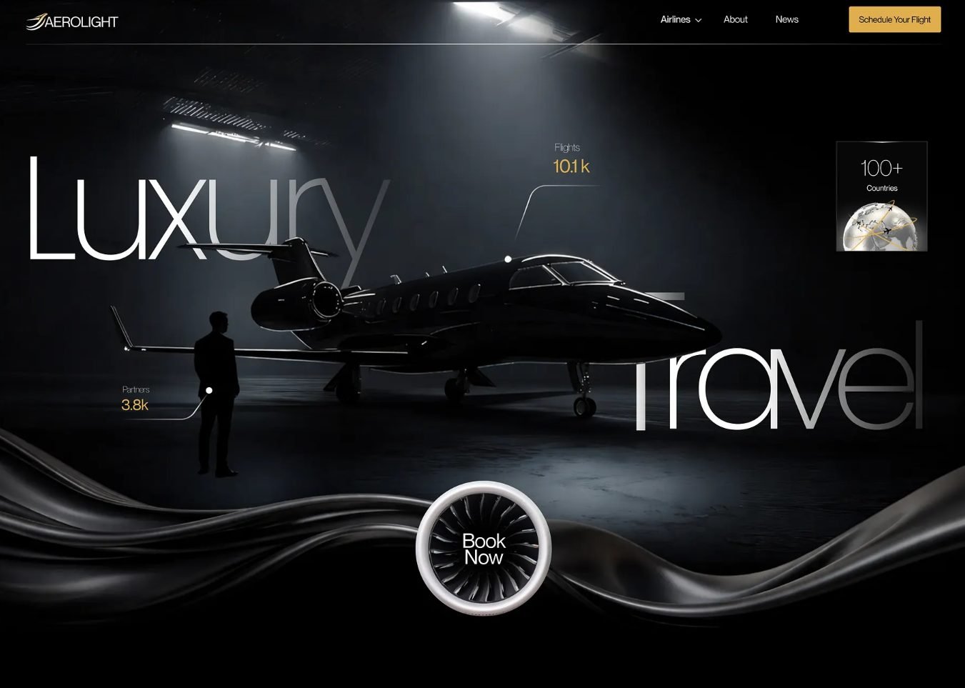
This is why the visual language of aviation feels so deliberate. Colors like deep blues convey trust, stability, and calm qualities essential in an industry where assurance is everything. Whites and light grays evoke cleanliness, precision, and transparency, reinforcing the idea of safety and control. Even metallic accents or gold tones, often seen in premium carriers, are used carefully to signal luxury without compromising clarity. Typography follows the same logic as graphics. Clean, sans-serif typefaces are favored for their legibility at a distance, across languages, and in high-stress environments like airports. There’s little room for decorative fonts when information needs to be read quickly and understood universally. Even layout and composition reflect this mindset structured, balanced, and predictable.
Safety as a Design Language
Safety is arguably the primary reason aviation visuals feel "bland," but that clinical feel is both intentional and necessary. When you’re in a high-stress environment like an airport, "fancy" takes a backseat to "functional." Whether it's a terminal map, a flight display, or a safety card, minimalist design removes the noise so the brain can process essential information instantly. According to William Lidwell’s Universal Principles of Design, simplicity isn’t just an aesthetic choice; it’s a tool for memorability and communication. In a global industry, stripping away the "unnecessary aesthetics" leaves room for what actually matters: efficiency, user experience, and most importantly safety.
Think about it: you’ve just landed in a foreign country. You’re tired, you don't speak the local language, and you're surrounded by unfamiliar signs. Yet, you can still find the baggage claim or the exit. That’s the power of universally recognized icons and clean layouts. These designs bridge cultural gaps, allowing anyone to navigate safely without needing a translator. In an emergency, we don't have time to interpret complex art; we need symbols that speak at the speed of sight.
Modern Rebranding
We often see "Millennial Branding" used as a bit of a critique an umbrella term for the flat colors and restrained typefaces that define the modern era. While we’ve moved away from the ornate, busy logos of the past, this shift toward minimalism serves a purpose. It creates a brand identity that is bold yet readable at a glance.



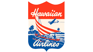

However, not every brand needs a total overhaul. Some of the most successful airlines choose to refine rather than replace. By modernizing subtle elements while keeping their core heritage intact, they maintain a sense of trust and history. It’s a delicate balance: staying relevant in a minimalist landscape without losing the "soul" that generations of passengers have come to recognize.






Where Creativity Takes Flight
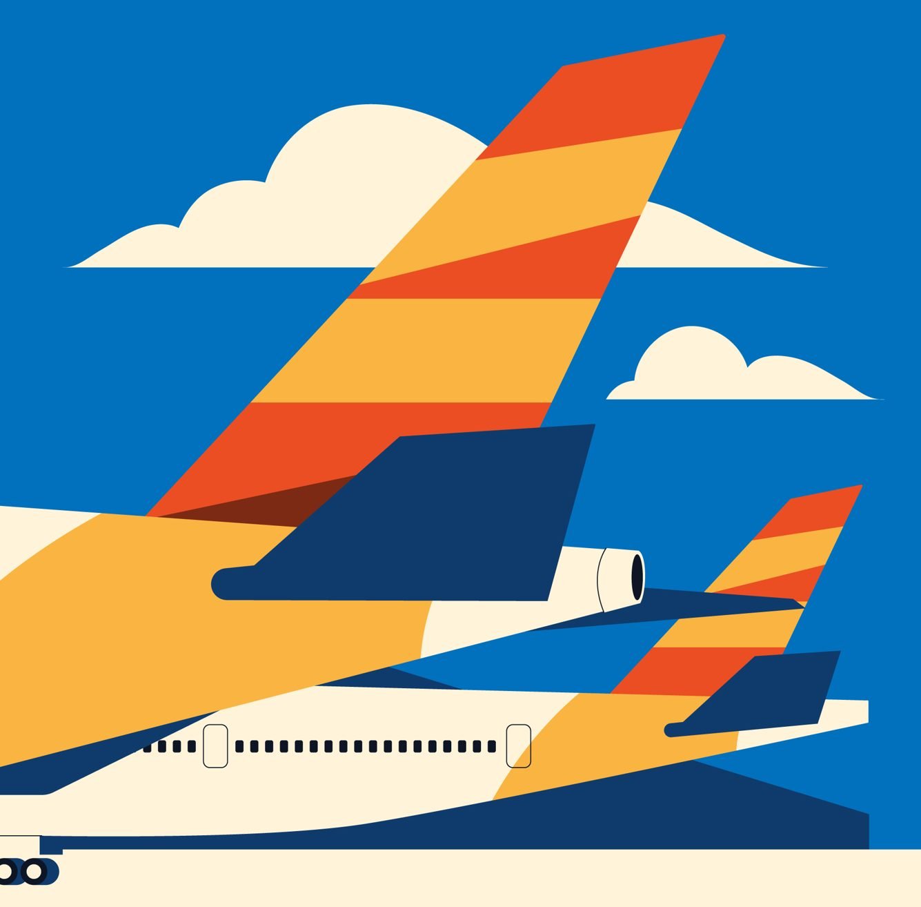
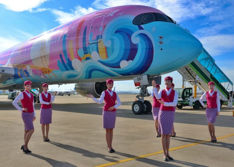
Despite the strict rules of simplicity, creativity hasn't been grounded, it’s just found a different canvas. Aircraft liveries are the ultimate "flying ambassadors." They prove that you can still tell a story and capture attention in the sky while following the principles of clean design. Whether it’s a bold themed wrap or a sleek, classic tail, the best liveries find that "sweet spot" where art meets brand identity.
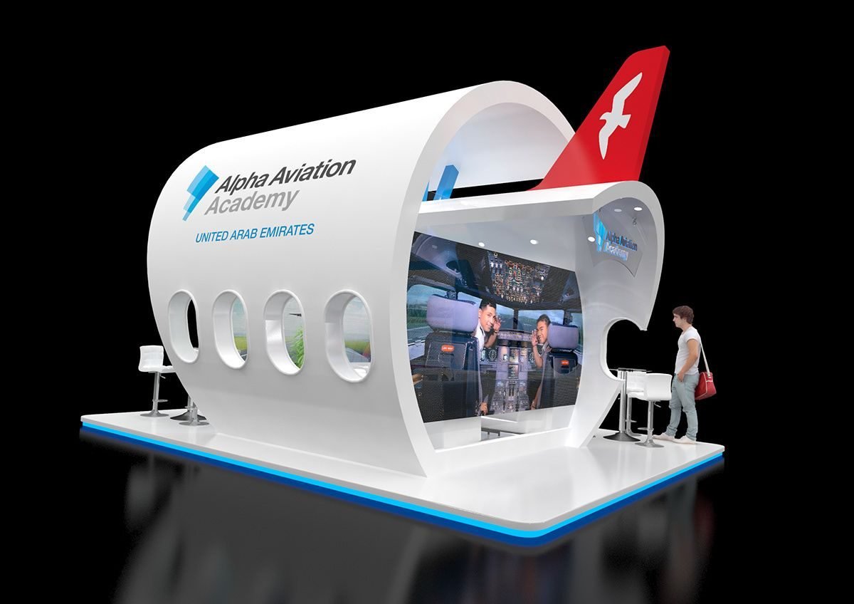
Events and exhibits also offer a playground for designers to push boundaries. These spaces take those minimalist principles and turn them into immersive experiences. It’s here that aircraft forms and signage systems can be reinterpreted through spatial design to grab a network's attention.
Takeaway
Creativity in aviation isn't about how much you can add; it's about how much you can communicate with as little as possible. Everyone has a creative spark, but the secret to great design is knowing how to highlight your subject without overcomplicating it. Always keep an "open book" policy, ask for feedback and see your work through the eyes of an outsider. After all, if they can't understand it at a glance, the design hasn't done its job well.